
 I love styling my images with CSS. I want to share in this post some of the tricks I use to improve bitter-tasting “alone” images. I know that there are a lot of articles talking about how to style your image with Photoshop, Gimp or so on. But let’s talk honestly; this can’t be applied for every time. I mean that imagine if you want to modify the color of the border you have chosen for your image; using CSS will be slick and less tedious than taking the image and
customize it again with your preferred Image Manipulation Program. This was just a simple example talking about the image styling inside a Web context of course. To ease this soreness, here are some CSS techniques which can help you.
Create a double Border Image
 Very easy of course, but really has a significant impact on your presentation, we can create a double border for our image by doing so:
HTML
Create your Watermark Effect
 The Watermark is basically used for a protection purpose of your images. So in this case, you can add any Watermark image you want (your Logo, a drawing…). To do so, I have chosen to lower the opacity of the principal image (forest.jpg) in order to let the background image (watermark.jpg) to sweep through.
HTML
Create a caption for Image
 This is useful too if you want to add more clearness to your image.
HTML
Create your Image Loading message
 Okay, you will say that it is not only CSS but with a little bit of
JavaScript. I agree! This kind of effect allows you to improve the image layout in your HTML pages. The loading message will fade out as the image appears along. So let’s explain the JavaScript code used here:
HTML
The id “holder” contains the image wewant to display (forest.jpg):
dimensions are 500x336, the ‘holder’ should have the same dimensions and should also display the ‘loading’ message/image in the center of the main image. This is the reason why we will use the following CSS elements:
CSS
The photo does not appear since the first glimpse, so to do so; we will set up the CSS visibility property to hidden.
Once every component on the page has been loaded, we have just to call the initialize JavaScript function to make the relevant job.
The initialize function exists on the loading.js script that you should take into account:
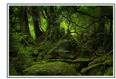
Create a double Border Image
Very easy of course, but really has a significant impact on your presentation, we can create a double border for our image by doing so:HTML
<img class="double" src="forest.jpg" alt="Forest" />CSS
img.double {
border: 5px solid #6F7C72;
padding: 5px;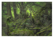
}Create your Watermark Effect
The Watermark is basically used for a protection purpose of your images. So in this case, you can add any Watermark image you want (your Logo, a drawing…). To do so, I have chosen to lower the opacity of the principal image (forest.jpg) in order to let the background image (watermark.jpg) to sweep through. HTML
<div class="transprincpal">CSS
<img class="watermark" src="forest.jpg" alt="" />
</div>
.transprincpal {
background: #000 url(watermark.jpg) no-repeat;
width: 500px;
margin: 0 auto;
}
img.watermark {
/* Old Mozilla and Firefox*/
-moz-opacity:.80;
/* Safari<1.2 and Konqueror*/
-khtml-opacity:.80;
/* IE*/
filter:alpha(opacity=80);
/* CSS3, Safari 1.2, Firefox and Mozilla*/
opacity:.80;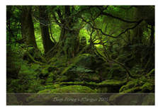
}Create a caption for Image
This is useful too if you want to add more clearness to your image. HTML
<div class="caption">CSS
<img src="forest.jpg" alt="" />
<cite>Deep Forest - JCargoo 2005</cite>
</div>
.caption {
position: relative;
display: block;
width: 500px;
margin: 0 auto;
}
.caption cite {
background: #4E453F;
/* Old Mozilla and Firefox*/
-moz-opacity:.50;
/* Safari<1.2 and Konqueror*/
-khtml-opacity:.50;
/* IE*/
filter:alpha(opacity=50);
/* CSS3, Safari 1.2, Firefox and Mozilla*/
opacity:.50;
color: #fff;
position: absolute;
bottom: 0;
left: 0;
width: 500px;
padding-top: 10px;
padding-bottom: 10px;
border-top: 1px solid #fff;
}
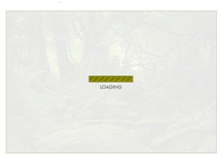
Create your Image Loading message
Okay, you will say that it is not only CSS but with a little bit ofJavaScript. I agree! This kind of effect allows you to improve the image layout in your HTML pages. The loading message will fade out as the image appears along. So let’s explain the JavaScript code used here:
HTML
The id “holder” contains the image wewant to display (forest.jpg):
<p id="holder">The 'loading' image is simply a background of the holder id. As per the main image (forest.jpg)
<img src="forest.jpg" alt="Deep Forest" id="myphoto" />
</p>
dimensions are 500x336, the ‘holder’ should have the same dimensions and should also display the ‘loading’ message/image in the center of the main image. This is the reason why we will use the following CSS elements:
CSS
#holderJavaScript
{
width:500px;
height:336px;
background: url(loading.gif) no-repeat #fff 50% 50%;
border:1px solid #CFB997;
}
#myphoto
{
width:500px;
height:336px;
}
The photo does not appear since the first glimpse, so to do so; we will set up the CSS visibility property to hidden.
document.write("<style type='text/css'>#thephoto {visibility:hidden;} </style>");Once every component on the page has been loaded, we have just to call the initialize JavaScript function to make the relevant job.
window.onload = function() {initialize()}The initialize function exists on the loading.js script that you should take into account:
<script src="loading.js" type="text/javascript"></script>This main function uses opacitySetter function to set the main image opacity to zero (completely transparent). After this stage, the photo will be visible thanks to the fadeIn function.
function initialize() {
imageId = 'myphoto';
theImage = document.getElementById(imageId);
opacitySetter(theImage, 0);
theImage.style.visibility = "visible";
fadeIn(imageId,0);
}
The fadeIn is a recursive function which uses a Timeout of 200ms to call itself. This function uses the opacitySetter. Every loop the fadeIn function increases the opacity with 10% so that our main image increasingly appears. We stop the loop as soon as the image opacity is complete (100%). function fadeIn(Id,opacity) {
if (document.getElementById) {
o = document.getElementById(Id);
if (opacity <= 100) {
opacitySetter(o, opacity);
opacity += 10;
window.setTimeout("fadeIn('"+Id+"',"+opacity+")", 200);
}
}
} How to encourage this blog if you like it:
- Promote our sponsors;
- Add any kind of comment or critic;
- Ask me directly by email if you prefer.


 I am
I am 


Hi jcargo;
for the last example I think it is useless. Why don't you talk about a server side running instead? The image can be loaded without this worthless stuff of the "loading message"?
Ey jcargoo I was seeking right now for somthning similar so thanks!!!
"The Watermark is basically used for a protection purpose of your images."
This is profoundly moronic. A CSS watermark is completely useless for copy protection. Want proof? View the watermark demo, right-click the image, and click "View Image". Surprise! The watermark is gone!
@mistercow,
I agree with you when you said that the Watermark is not used for a protection purpose. But just wait a minute. What I mean here is that the “normal/natural” Watermark was done normally for that purpose and it obviously is if you share your image in the Web with a burned logo --in only one image. But of course, in my code I have 2 images; one for the main images and the second is for the Watermark. Thus I beforehand know that the two images are absolutely separated. Let’s say that is a “digital Watermark-like“. To sum up, the purpose of this part of article was about how you can create a Watermark with CSS and no more else.
@antonio
Sorry but it is not useless. Before that the function is performing its job, we have a “loading message” telling the user that the process is ongoing. Don't forget that the aim here is the fade-in.
hey, thanks for sharing -- samples are quite usefull and well explained