
 In this example, I would like show you how it would be great and also simple if you use the
 CSS3’s -webkit-transform property in order to spice your logo or image with a pretty reflection.
Here is what the main CSS code looks like:
CSS
.reflected {
background: #fff url(mycar.jpg) no-repeat;
padding-top: 252px;
height: 150px;
overflow: hidden;
float: left;
position: relative;

}
.reflected img{
-webkit-transform: rotate(180deg);
opacity:0.5;
}
The -webkit-transform property is used to rotate mycar.jpg image by 180 degrees. Since this is done, we will set the opacity to 0.5 in order to give our reflection a very much alive aspect.And our HTML code will be as follows:
HTML
<div class="reflected">Final result:
<img src="mycar.jpg" />
</div>
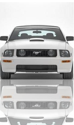 Please be aware again that this example was tested in quite some browsers, and the only web browsers that support this CSS property until now are Chrome and Safari.
I have struck the CSS3 word as technically speaking, the -webkit-transform property is not at all a “CSS 3” property– sorry I was wrong. But it remains just a proprietary extension of the W3C spec.
 How to encourage this blog if you like it:
- Promote our sponsors;
- Add any kind of comment or critic;
- Ask me directly by email if you prefer.


 I am
I am 


Good now you have corrected it because of course it is not a CSS3 property.
Have a Good luck.
Try with: -webkit-transform: scale(1,-1);
That gives you a proper mirror effect:)
You can use -webkit-box-reflect in combinaison with -webkit-gradient. See http://webkit.org/blog/182/css-reflections/ .
Thank you so much Rik, I really appreciate!