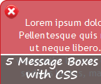
 Alert boxes are well-known in all kind of applications. A stylish alert box is a good way to show you creativity but of course before that; get the full user’s attention.
This article will present you two things: 5 free notification boxes to use/customize as well as a very simple technique about how to create your own ones inspired from this roundup. You will see that the power of CSS will widely help our needs. First, let’s have a look at the outcome.
I have no enough time to go design corners using a drawing tool. This is why and for a simple use, I choose to use online tools like:
This generator will suit exactly what we need to create round corners.
Now, let’s have a look at the global HTML shared by all message boxes:
Explanation
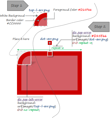
Step 1:
The generated corner; top-l-err.png (by the online tool presented above) has 3 properties:
Here you can understand the importance of the white background of top-l-err.png which will hide the “real” box border.
Step 2:
dot-err.png (1x1) is repeated horizontally thanks to top-error CSS class in order to define a top border for our box.
As I said before, this same method will be applied for the rest of borders/corners. We only need to modify the starting position of the background image as well as background colors.
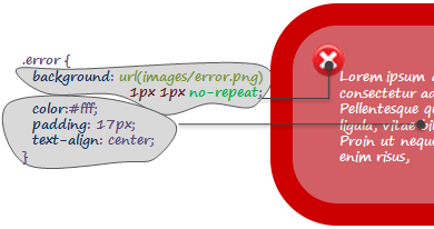
Now to style our message box content, we will use for every kind of box a dedicated class. Here is an example of how we style the error message box:
Here is the final result for each kind of message box:
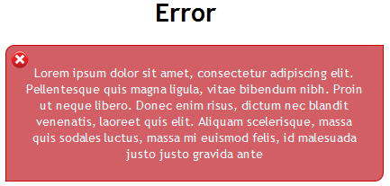
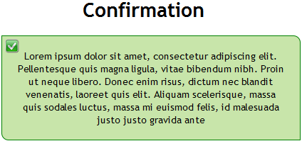
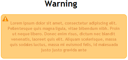
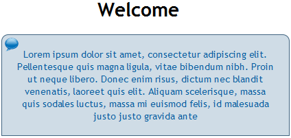
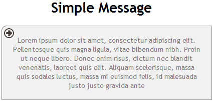
It is over to you now to use the same boxes or to customize (colors, corner radius, background images…) depending on your needs.
Read also:
I have no enough time to go design corners using a drawing tool. This is why and for a simple use, I choose to use online tools like:
This generator will suit exactly what we need to create round corners.
Now, let’s have a look at the global HTML shared by all message boxes:
<div class="top-...">
<div class="bottom-...">
<div class="left-...">
<div class="right-...">
  <div class="border-right-...">
    <div class="bottom-left-...">
      <div class="top-right-...">
        <div class="top-left-...">
          <div class="...">Lorem ipsum dolor sit amet, consectetur adipiscing elit. Pellentesque quis magna ligula,

vitae bibendum nibh. Proin ut neque libero. Donec enim risus, dictum nec blandit venenatis, laoreet quis elit. Aliquam

scelerisque, massa quis sodales luctus, massa mi euismod felis, id malesuada justo justo gravida ante</div>
        </div>
      </div>
    </div>
  </div>
</div>
</div>
</div>
</div>
Explanation
- We have defined 8 main CSS classes. Every class will define either the border or the corner to be used (top, right, bottom, left);
- Depending on which kind of box we will use in each box, the total of the CSS classes should be different from a box to another.

Step 1:
The generated corner; top-l-err.png (by the online tool presented above) has 3 properties:
- A white background: you can choose your own depending on what is the background you are using in your template;
- A border color: Same color of the defined box border;
- A foreground color: This is the same as the content color of the box.
Here you can understand the importance of the white background of top-l-err.png which will hide the “real” box border.
Step 2:
dot-err.png (1x1) is repeated horizontally thanks to top-error CSS class in order to define a top border for our box.
As I said before, this same method will be applied for the rest of borders/corners. We only need to modify the starting position of the background image as well as background colors.
Now to style our message box content, we will use for every kind of box a dedicated class. Here is an example of how we style the error message box:

Here is the final result for each kind of message box:


It is over to you now to use the same boxes or to customize (colors, corner radius, background images…) depending on your needs.
Read also:
 How to encourage this blog if you like it:
- Promote our sponsors;
- Add any kind of comment or critic;
- Ask me directly by email if you prefer.


 I am
I am 


