Showing posts with label CSS/Design. Show all posts

5 Message Boxes to Style your Notifications with CSS

Posted by jcargoo | Saturday, November 28, 2009
| 0Delicious Twitter Reddit Digg Loading...

Alert boxes are well-known in all kind of applications. A stylish alert box is a good way to show you creativity but of course before that; get the full user’s attention.

This article will present you two things: 5 free notification boxes to use/customize as well as a very simple technique about how to create your own ones inspired from this roundup. You will see that the power of CSS will widely help our needs. First, let’s have a look at the outcome.

I have no enough time to go design corners using a drawing tool. This is why and for a simple use, I choose to use online tools like:


This generator will suit exactly what we need to create round corners.
Now, let’s have a look at the global HTML shared by all message boxes:
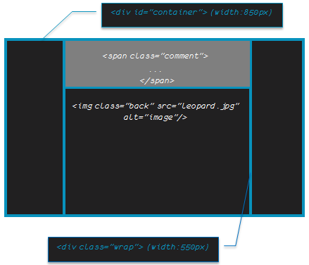
<div class="top-...">
<div class="bottom-...">
<div class="left-...">
<div class="right-...">
<div class="border-right-...">
<div class="bottom-left-...">
<div class="top-right-...">
<div class="top-left-...">
<div class="...">Lorem ipsum dolor sit amet, consectetur adipiscing elit. Pellentesque quis magna ligula,

vitae bibendum nibh. Proin ut neque libero. Donec enim risus, dictum nec blandit venenatis, laoreet quis elit. Aliquam

scelerisque, massa quis sodales luctus, massa mi euismod felis, id malesuada justo justo gravida ante</div>
</div>
</div>
</div>
</div>
</div>
</div>
</div>
</div>

Explanation
  • We have defined 8 main CSS classes. Every class will define either the border or the corner to be used (top, right, bottom, left);
  • Depending on which kind of box we will use in each box, the total of the CSS classes should be different from a box to another.
I will take a general example to show how our round corners will be implemented. This following figure will focus only on two CSS classes top-left-error and top-error. All the rest of classes will apply the same steady method:

Step 1:

The generated corner; top-l-err.png (by the online tool presented above) has 3 properties:
  • A white background: you can choose your own depending on what is the background you are using in your template;
  • A border color: Same color of the defined box border;
  • A foreground color: This is the same as the content color of the box.
top-l-err.png will be placed in the top left of the box thanks to top-left-error CSS class.
Here you can understand the importance of the white background of top-l-err.png which will hide the “real” box border.

Step 2:

dot-err.png (1x1) is repeated horizontally thanks to top-error CSS class in order to define a top border for our box.
As I said before, this same method will be applied for the rest of borders/corners. We only need to modify the starting position of the background image as well as background colors.
Now to style our message box content, we will use for every kind of box a dedicated class. Here is an example of how we style the error message box:

Here is the final result for each kind of message box:


It is over to you now to use the same boxes or to customize (colors, corner radius, background images…) depending on your needs.
Read also:
Read More


Overlay Text over an Image with a Very Simple jQuery Snippet

Posted by jcargoo | Monday, August 10, 2009
, | 0Delicious Twitter Reddit Digg Loading...

This post will show you how much jQuery is helpful to give a trendy face of the presentation of your images.
There are some developers who want only to put fixed text messages above the images. But there are others who like to add some spices to their images look.


This code which I will show you has been developed to be clear and simple as much as possible.


The main idea behind consists to let user get the comment (or explanation) of the image he is hovering. This comment will appear when the user hover over the image, and will disappear when the mouse is out of the image.

So here I go. Our schematic will be like following:


Then the HTML code is:


<div id="container">
<div class="wrap">
<img class="back" src="leopard.jpg" alt="image"/>

<span class="comment">
Apple - Mac OS X Snow Leopard <br/> The world's most advanced OS
</span>
</div>
</div>

Note that the width/height of the wrap div is the same as those of the image.

The CSS is also simple to understand:

#container {
width: 850px;
text-align: center;
margin: auto;
}

.back
{
position:absolute;
top:0;left:0;
}
.wrap
{
width:550px;
height:390px;
position:relative;
margin:auto;
overflow:hidden;
}

.comment
{
position:absolute;
width:550px;
top:400px;
left:0px;
letter-spacing: -1px;
color: white; font: 24px/45px Berlin Sans FB, Sans-Serif;
background: #4A4D4A;
padding: 10px;
filter:alpha(opacity=60);
-moz-opacity:0.6;
-khtml-opacity: 0.6;
opacity: 0.6;
line-height: 90%
}

  • The image class as well as the comment class should have absolute position in order to have the comment to be stuck on the image. Thus, the wrap class should be defined with relative position;
  • The overflow should be set to hidden for wrap class. This is done to hide the comment when it goes back;
  • There are the only important things to talk about. Otherwise, the rest of the parameters is clear to devour.

Finally, let’s talk about jQuery code. This code is a way to fulfill our task which is spicing our image look.


$(function(){

$('.wrap').hover(function(){
$(this).children('.comment').stop().css("top", "0px");}

, function(){
$(this).children('.comment').stop().animate({"top": '400px'}, 600);});

});


We used hover jQuery event. The top value of the comment was 400px, which means that it was out of our eyesight. Now jQuery helps us to resotre it (set the top value to 0). Since the mouse is out of the image, the second function is fired with some animation thanks to jQuery effect.

For any kind of suggestion, please don’t hesitate.


Tested successfully in Safari, FF, IE and Chrome (last versions)
Read More


Preloaders in 3D

Posted by jcargoo | Wednesday, February 11, 2009
| 0Delicious Twitter Reddit Digg Loading...

I was just searching for a nice 3D loading image to put it in a form when a user submits his login details (in my application).
If you remember I have already talked about ajaxload which eases your life to create your own ajax loader icon.
Now I am so glad to give you another useful link that can help you to

create your animated gif preloader. The service is called Preloaders. You have simply to choose:

Categories: 3 dimensional (3D), Rectangular, Circular, or Horizontal;
  • Preloader type;
  • Background color;
  • Foreground color;
  • Size of your gif;
  • Animation speed of your preloader.

That’s all.


Read More


3 Table Designs Based on CSS

Posted by jcargoo | Thursday, January 22, 2009
| 0Delicious Twitter Reddit Digg Loading...

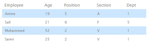
This article comes in handy because it will provide you some examples showing how you can style tables with CSS. There are 3 examples of CSS table designs that I like to show you in the current post:
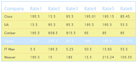


Let’s start with talking about the general XHTML code of each table:
HTML

<!-- Table markup-->

<table id="...">

<!-- Header -->

<thead>
<tr>
<th scope="col">...</th>
...
</tr>
</thead>


<!-- Body of the Table -->

<tbody>
<tr>
<td>...</td>
...
</tr>
...
</tbody>

</table>
Example 1
We simply play with borders, padding, colors, backgrounds, and hover effects of the table cells. When you hover over every row, this row becomes clearly apparent.
CSS
#table1
{
font-size: 12px;
margin: 50px;
width: 500px;
text-align: left;
border-collapse: collapse;
border: 1px solid #99CCFF
}
#table1 th
{
padding: 20px 10px 10px 10px;
font-weight: normal;
font-size: 16px;
color: #99CCFF;
}
#table1 tbody
{
background: #F5F39F;
}
#table1 td
{
padding: 10px;
color: #3E3E3E;
border-top: 1px dashed #F7AE65;
}
#table1 tbody tr:hover td
{
color: #fff;
background: #CCE6FF;
}
Example 2
This is a nice design which you can customize in order to let colors (of borders and of cells) mach with your site colors.
Here is the CSS:
CSS
#table2
{
font-size: 12px;
margin: 50px;
width: 500px;
text-align: center;
border-collapse: collapse;
border-top: 7px solid #99CCFF;
border-bottom: 7px solid #99CCFF;
}
#table2 th
{
font-size: 13px;
font-weight: normal;
padding: 8px;
background: #FFF5F2;
border-right: 1px solid #99CCFF;
border-left: 1px solid #99CCFF;
color: #767676;
}
#table2 td
{
padding: 8px;
background: #CCE6FF;
border-right: 1px solid #99CCFF;
border-left: 1px solid #99CCFF;
color: #767676;
}

Example 3
This is a zebra table. The aim is to alternate background color to make things more clear for people reading table data. Simply add class="select" to every tr tag that you want to be colored like the following:
HTML

<tr class="select">
<td>Mohammed</td>
<td>52</td>
<td>2</td>
<td>V</td>
<td>1</td>
</tr>
<tr>
<td>Samir</td>
<td>25</td>
<td>2</td>
<td>V</td>
<td>1</td>
</tr>

The CSS will be defined like this:
CSS
#table3
{
font-size: 12px;
margin: 50px;
width: 500px;
text-align: left;
border-collapse: collapse;
}
#table3 th
{
font-size: 14px;
font-weight: normal;
padding: 10px 8px;
color: #767676;
}
#table3 td
{
padding: 10px;
color: #767676;
}
#table3 .select
{
background: #CCE6FF;
}

Read More


CSS Navigation Bar With Only 1 Image

Posted by jcargoo | Tuesday, January 20, 2009
| 0Delicious Twitter Reddit Digg Loading...

This is a technique which can help to develop a nice navigation bar using only one image for all link buttons.
The image was simply created thanks to Microsoft Office Powerpoint 2007!
Why I am talking about only 1 image? Because using only 1 image will increase the processing time as well as

the bandwidth if you compare this with using 5 images (in this example we have 5 links).

This is the image we will use (click over it if you want to get the real size):

In order to hold a part of the image, we will use a span inside the link in the list (the list represents the whole navigation bar).

HTML
<ul class="image">
<li><a href="#" title="Home" class="current"><span></span>Home</a></li>
<li><a href="#" title="Tutorials"><span></span>Tutorials</a></li>
<li><a href="#" title="Archives"><span></span>Archives</a></li>
<li><a href="#" title="About"><span></span>About</a></li>
<li><a href="#" title="Contact us"><span></span>Contact us</a></li>
</ul>

CSS

ul:

Nothing to really explain here as every thing seems to be clear. We want to say that we don't want any kind of bullet in our navigation menu so this is why we have list-style set to none. We have defined some borders to make a beautiful navigation bar. <li> and <span> will have float left so same thing will be defined in the current <ul>. Using float: left, you can place whatever below your CSS navigation menu and it will display alongside the menu and not below it.

ul.image {
padding: 3px;
list-style: none;
background-color: #fff;
border-bottom: 1px solid #E8E8FF;
border-left:1px solid #E8E8FF;
float: left;
clear: left;
}

li:
As mentioned above we use float with left value for <li>. The used margin value is for the space between the list buttons.

ul.image li {
float: left;
}

ul.image li a {
float: left;
text-decoration: none;
color: #E2E4EC;
padding: 3px 19px 0 0;
margin-right: 15px;
font: 700 14px "Georgia", Helvetica, sans-serif;
}

span:
ul.image li a span {
float: left;
padding-right: 19px;
display: block;
margin-top: -3px;
height: 30px;
}

hover and current:
I wanted to not combine following CSS codes to make thnings clear regarding when we hover a link, hover over a span, and when the current button is activated.

ul.image li a:hover {
color: #1A61A9;
background: url(1.png) no-repeat top right;
}

ul.image li a:hover span {
background: url(1.png) no-repeat top left;
}

ul.image li a.current {
background: url(1.png) no-repeat top right;
color: #1A61A9;
}

ul.image li a.current span {
background: url(1.png) no-repeat top left;
}

Read More


Image Reflection With -webkit-transform Property

Posted by jcargoo | Saturday, January 10, 2009
| 0Delicious Twitter Reddit Digg Loading...

In this example, I would like show you how it would be great and also simple if you use the CSS3’s -webkit-transform property in order to spice your logo or image with a pretty reflection.


View Demo (works only with Chrome and Safari)

Here is what the main CSS code looks like:

CSS
.reflected {
background: #fff url(mycar.jpg) no-repeat;
padding-top: 252px;
height: 150px;
overflow: hidden;
float: left;
position: relative;

}
.reflected img{
-webkit-transform: rotate(180deg);
opacity:0.5;
}
The -webkit-transform property is used to rotate mycar.jpg image by 180 degrees. Since this is done, we will set the opacity to 0.5 in order to give our reflection a very much alive aspect.

And our HTML code will be as follows:

HTML
<div class="reflected">
<img src="mycar.jpg" />
</div>

Final result:
Please be aware again that this example was tested in quite some browsers, and the only web browsers that support this CSS property until now are Chrome and Safari.

I have struck the CSS3 word as technically speaking, the -webkit-transform property is not at all a “CSS 3” property– sorry I was wrong. But it remains just a proprietary extension of the W3C spec.
Read More


VixML: A Simple Platform for the iPhone Platform

Posted by jcargoo | Tuesday, January 6, 2009
| 0Delicious Twitter Reddit Digg Loading...

If you always wish to develop your own iPhone/iPod Touch applications but you don’t have enough SDK programming knowledge for this kind of devices you will most assuredly love VixML. This platform released by the developers of Viximo will allow

the designers to create basic iPhone applications (with full access to phone’s multi-touch interactivity functions) with a minimal amount of programming knowledge.


VixML toolkit includes an editor and simulation engine for building and previewing the coding designs. It is based on the XML markup language. It uses a number of pre-designated tags, the VixML WYSIWYG SDK and emulator. Those tags allow developers and designers to make their applications sensitive to some common iPhone user inputs, including shaking! So no need to touch any Objective C.
TechCrunch has covered the VixML launch and said that for now applications created using VixML can only be published to Viximo’s upcoming TrueFlirt app, which lets users create send to friends, and view “flirtatious” animations and mini-apps for the iPhone.


There are of course other interesting iPhone development platforms like:
  • Phonegap which is a development tool that allows web developers to take advantage of the core features in the iPhone, Android, and Blackberry SDK using JavaScript. The whole platform is a sort of container for web applications running on the iPhone that allows them to access the GPS, the camera, vibration controls and so on.
  • Big Five which is a web application gateway for the iPhone and iPod Touch that offers an API allowing developers to access native iPhone functions such as the GPS, and camera via JavaScript.
Here is a video showing a cool experience done with VixML I have got from VixML examples page.


Read More


Star Rating System with CSS and jQuery

Posted by jcargoo | Thursday, December 25, 2008
, | 0Delicious Twitter Reddit Digg Loading...

I wanted to show in this article how possible to create a nice star rater using CSS and jQuery. Every one of us knows how sometimes it is important to embed a star rating feature pretty near an article or a video to allow all visitors to size up this article or video.
In order to shape our star rater, let’s get first as usual to structure.


Our star rater will be a sort of list of links:
HTML
<div id ="stars-container">
<h1>Star Rater with CSS/jQuery</h1>
<ul class='star-rate'>
<li><a href='#' title='' class="star-one">mmmm</a></li>
<li><a href='#' title='' class="star-two">try again</a></li>
<li><a href='#' title='' class="star-three">mmm not bad</a></li>
<li><a href='#' title='' class="star-four">this is cool ya!</a></li>
<li><a href='#' title='' class="star-five">very good</a></li>
</ul>
</div>

<div id ="remark"></div>


Every anchor item element has a defined class as well as a content which describes what should be displayed when we will hover over a star. For example, if we hover over the second star, the message “try again” will be displayed in the same HTML page.
You could use Ajax to attach different actions to each link.
For example: Store the mark in database that the user has chosen. However, I will not cover that here.
CSS
The ul element CSS class is star-rate:
.star-rate{
/* The list contains 5 stars. Each one is 30px, so 5 x 30px = 150px wide */
width: 150px;
/* Each star has 30px height. The list of stars is horizontal list, so its height will be the same one as the star’s one*/
height: 30px;
margin: 0px;
padding:0px;
/* Snuff out the default list image bullets */
list-style:none;
/* We will use later the absolute positioning. So let’s use relatively-absolute positioning */
position: relative;
/* The list will have five stars thanks to repeat-x */
background: url(stars.gif) top left repeat-x;
}
.star-rate li{
float: left;
}
Now for the anchor items within the list items, we will define the CSS like so:
CSS
.star-rate li a{
/*Same star image dimensions 30x30*/
width:30px;
height: 30px;
padding: 0px;
display:block;
/*Remove the underline from the link*/
text-decoration: none;
/*Indent the text off the screen (push the inner text off the screen)*/
text-indent: -8000px;
z-index: 10;
/* In the ul class “star-rate” we used relative position to allow us to use now the absolute position so that we can control the exact (x,y) coordinates of each star relative to the parent ul*/
position: absolute;
}
.star-rate li a:hover{
background: url(stars.gif) left;
/* Move this star to the bottom of the z-index stack */
z-index: 1;
/* Move this star all the way to the left */
left: 0px;
border:none;
background-position:30px 60px;
}
Let’s explain what was not explained above. The specific link that we hover gets pushed all the way to the bottom of the z-index stack (z-index value of “.star-rate li a:hover” should be less than the z-index value of “.star-rate li a”). The link then has a background image load in with a background-position of 30px 60px so that only this part of the image will be displayed:

Each link on :hover should be as wide as its number of stars x 30px.
Example: for two stars we have: 2 x 30px = 60px, for three stars: 3 x 30px = 90px and so on.
This explains why we put a class on each different link.


CSS
.star-rate a.star-one{
left: 0px;
}
.star-rate a.star-one:hover{
width:30px;
}
.star-rate a.star-two{
left:30px;
}
.star-rate a.star-two:hover{
width: 60px;
}
.star-rate a.star-three{
left: 60px;
}
.star-rate a.star-three:hover{
width: 90px;
}
.star-rate a.star-four{
left: 90px;
}
.star-rate a.star-four:hover{
width: 120px;
}
.star-rate a.star-five{
left: 120px;
}
.star-rate a.star-five:hover{
width: 150px;
}
jQuery
jQuery comes to our aid with the hover() command. When we hover over each link inside every list item we display its text inside the #remark id div and we remove the text as soon as we don’t hover over the link.

$(function(){
$( ".star-rate li a" ).each(function(i){
$(this).hover(function(){
$("#remark").append("<div id=\"core\">"+$(this).html()+"</p>");
},function(){
$("#core").remove();
});
});
});


Download Here


That’s it! Please feel free to comment
Read More


Creating a Progress Bar Using CSS and JavaScript

Posted by jcargoo | Tuesday, December 23, 2008
, | 0Delicious Twitter Reddit Digg Loading...

I wanted before talking about this progress bar to create an understandable and simple code. This progress bar is not at all linked to a server side running program like an upload file application or any kind of Web application using a progress bar. The purpose here is roundly to show how we can mold a good HTML structure with a nice design using CSS and a simple JavaScript code to assume progress bar command.
First, let’s get to structure.


HTML
<div class="progress-bar" >
<div id ="sample" class="bar">75%</div>
</div>
<div id ="percentage"></div>


This is so easy to understand as we have 2 div tags. The first one (.progress-bar) is a sort of progress bar container and the second one (#percentage) is created to show the current percentage during the time that the progress bar is running.

Now let’s get into the meat of the CSS

CSS
/*Container*/
.progress-bar {
border: 1px solid #56577A;
/*width of the progress bar container*/
width: 200px;
margin: 5px;
padding: 1px;
background: #fff;
float: left;
}

/*Progress Bar*/
.bar {
height: 15px;
font-size: 11px;
/* indent the text off the screen as we don’t want to see the text anymore.*/
text-indent:-9000px;
}

Finally let’s go through the JavaScript snippet we have used.

Here how our code looks like in the HTML code:
<script src="progressbar.js" type="text/javascript"></script>

<script type="text/javascript">
window.onload = function() {initialize()}
</script>
As soon as the whole page is loaded the initialize function is called. This JavaScript function resides in progressbar.js.

JavaScript
function initialize() {
divId = 'sample';
thedivId = document.getElementById(divId);
var percentage = thedivId.innerHTML;
//Set the Progress Bar color
thedivId.style.backgroundColor="#BF5852";
brim(divId,0,parseInt(percentage.substr(0, percentage.length-1)));
}
The initialize function recovers the progress bar identified by the 'sample' ID as well as its percentage (in our case 75%). The recovered percentage (String) will after be cast to Int and proceed to the brim function with two other variables (before casting the percentage variable, we use the substr function to stamp out ‘%’).

Those variables are divId and the ‘start’ variable which specifies the percentage from which the progress bar should start --in this case the value of the start variable is 0 (0%).

Thanks to the brim recursive function (Timeout to call itself every 50ms), we will be able to let our progress bar to move on until it reaches the percentage we have set previously.

In the meanwhile setWidth function continues to update the width property of the progress bar.

JavaScript

function brim(Id,start,percentage) {
if (document.getElementById) {
o = document.getElementById(Id);
if (start <= percentage) {
setWidth(o, start);
start += 1;
//Show progression percentage near the progress bar
document.getElementById('percentage').innerHTML = (start -1) + "%";
window.setTimeout("brim('"+Id+"',"+start+","+percentage+")", 50);
}
}
}

function setWidth(o, start) {
o.style.width = start+"%";
}

Hope you enjoy this post. Every comment either to improve or criticize my code is welcome.


Download Here


Read More


Ajaxload: Free Ajax Loading Gif Generator

Posted by jcargoo | Monday, December 22, 2008
| 0Delicious Twitter Reddit Digg Loading...

In the new Web 2.0 applications, it is often useful to have a small animated gif to inform the users that there is an ongoing processing (For example; checking the presence of an entered login name in your database). This is the purpose for which the Ajax Load was born. Ajax Load is a loading

gif generator which allows you to automatically generate an animated gif corresponding exactly to your expected design (most often adapted to your WebApp design).


More than 30 great indicators for loading image are available to choose from.
You can select indicator type, background color or even transparent, foreground color for your loading image.

Read More


Background Images into Form Fields with CSS

| 0Delicious Twitter Reddit Digg Loading...

Adding some expressive background images to your HTML form can be considered sometimes as a relevant point. This can be done easily with pure CSS.
Here is what I want to accomplish:


And here are the

background images we are talking about.


To accomplish this we need to do so:

HTML
  <input type=text name="nom" class="search">
<input type="submit" class="button" value="search"/>
CSS
input.search {
background:url(search.png) left no-repeat;
padding: 1px 4px 1px 25px;
color:#3D3D3D;
background-color:#E8E8FF;
border:1px solid;
border-color: #374F7F;
font: 100% 'trebuchet ms',helvetica,sans-serif;
}

input.button {
background:url(accept.png) left no-repeat;
color:#050;
background-color:#E8E8FF;
border:1px solid;
border-color: #374F7F;
margin:2px;
padding: 0px 0px 0px 20px;
font: 100% 'trebuchet ms',helvetica,sans-serif;
}
The search class was defined to stop styling potential input fields like check boxes, radio buttons…
This can be useful also for username and password fields in order to let those fields look better.

Download Here


Read More


4 Simple and Great Methods to Style Your Images with CSS

Posted by jcargoo | Sunday, December 21, 2008
, | 0Delicious Twitter Reddit Digg Loading...

I love styling my images with CSS. I want to share in this post some of the tricks I use to improve bitter-tasting “alone” images. I know that there are a lot of articles talking about how to style your image with Photoshop, Gimp or so on. But let’s talk honestly; this can’t be applied for every time. I mean that imagine if you want to modify the color of the border you have chosen for your image; using CSS will be slick and less tedious than taking the image and

customize it again with your preferred Image Manipulation Program. This was just a simple example talking about the image styling inside a Web context of course. To ease this soreness, here are some CSS techniques which can help you.

Create a double Border Image

Very easy of course, but really has a significant impact on your presentation, we can create a double border for our image by doing so:


HTML
<img class="double" src="forest.jpg" alt="Forest" />
CSS
img.double {
border: 5px solid #6F7C72;
padding: 5px;
}


Create your Watermark Effect
The Watermark is basically used for a protection purpose of your images. So in this case, you can add any Watermark image you want (your Logo, a drawing…). To do so, I have chosen to lower the opacity of the principal image (forest.jpg) in order to let the background image (watermark.jpg) to sweep through.


HTML
  <div class="transprincpal">
<img class="watermark" src="forest.jpg" alt="" />
</div>
CSS
.transprincpal {
background: #000 url(watermark.jpg) no-repeat;
width: 500px;
margin: 0 auto;
}
img.watermark {
/* Old Mozilla and Firefox*/
-moz-opacity:.80;
/* Safari<1.2 and Konqueror*/
-khtml-opacity:.80;
/* IE*/
filter:alpha(opacity=80);
/* CSS3, Safari 1.2, Firefox and Mozilla*/
opacity:.80;
}


Create a caption for Image
This is useful too if you want to add more clearness to your image.


HTML
  <div class="caption">
<img src="forest.jpg" alt="" />
<cite>Deep Forest - JCargoo 2005</cite>
</div>
CSS
.caption {
position: relative;
display: block;
width: 500px;
margin: 0 auto;
}
.caption cite {
background: #4E453F;
/* Old Mozilla and Firefox*/
-moz-opacity:.50;
/* Safari<1.2 and Konqueror*/
-khtml-opacity:.50;
/* IE*/
filter:alpha(opacity=50);
/* CSS3, Safari 1.2, Firefox and Mozilla*/
opacity:.50;
color: #fff;
position: absolute;
bottom: 0;
left: 0;
width: 500px;
padding-top: 10px;
padding-bottom: 10px;
border-top: 1px solid #fff;
}


Create your Image Loading message
Okay, you will say that it is not only CSS but with a little bit of
JavaScript. I agree! This kind of effect allows you to improve the image layout in your HTML pages. The loading message will fade out as the image appears along. So let’s explain the JavaScript code used here:


HTML

The id “holder” contains the image wewant to display (forest.jpg):

<p id="holder">
<img src="forest.jpg" alt="Deep Forest" id="myphoto" />
</p>
The 'loading' image is simply a background of the holder id. As per the main image (forest.jpg)
dimensions are 500x336, the ‘holder’ should have the same dimensions and should also display the ‘loading’ message/image in the center of the main image. This is the reason why we will use the following CSS elements:

CSS


#holder
{
width:500px;
height:336px;
background: url(loading.gif) no-repeat #fff 50% 50%;
border:1px solid #CFB997;
}
#myphoto
{
width:500px;
height:336px;
}
JavaScript
The photo does not appear since the first glimpse, so to do so; we will set up the CSS visibility property to hidden.
document.write("<style type='text/css'>#thephoto {visibility:hidden;} </style>");

Once every component on the page has been loaded, we have just to call the initialize JavaScript function to make the relevant job.
window.onload = function() {initialize()}

The initialize function exists on the loading.js script that you should take into account:
<script src="loading.js" type="text/javascript"></script>
This main function uses opacitySetter function to set the main image opacity to zero (completely transparent). After this stage, the photo will be visible thanks to the fadeIn function.
function initialize() {
imageId = 'myphoto';
theImage = document.getElementById(imageId);
opacitySetter(theImage, 0);
theImage.style.visibility = "visible";
fadeIn(imageId,0);
}
The fadeIn is a recursive function which uses a Timeout of 200ms to call itself. This function uses the opacitySetter. Every loop the fadeIn function increases the opacity with 10% so that our main image increasingly appears. We stop the loop as soon as the image opacity is complete (100%).
function fadeIn(Id,opacity) {
if (document.getElementById) {
o = document.getElementById(Id);
if (opacity <= 100) {
opacitySetter(o, opacity);
opacity += 10;
window.setTimeout("fadeIn('"+Id+"',"+opacity+")", 200);
}
}
}

Read More


Fast Rollovers Without Preload

Posted by jcargoo | Tuesday, November 11, 2008
| 0Delicious Twitter Reddit Digg Loading...

Live Demo here
HTML code here

We've got here one image for each state (normal, hover, active, visited etc). Putting all states into one image makes dynamic changes faster and requires no preload.


Let's take an example

.

Usually, in CSS rollovers, we use background images in this way:
#menu a {
...
background: url("button.gif") top left no-repeat;
}
#menu a:hover {
...
background-image: url("button-over.gif");
}
#menu a:active {
...
background-image: url("button-active.gif");
}

/* etc... */
The menu items are the a-elements with display:block. Proper padding and background image for a, a:hover and a:active make the rollover.
To simplify the rollover, we can use instead only one picture containing three states of a button: normal, :hover, and :active.

When using one common picture, we don't need to change the background image. We just change its background-position. The :hover state will use the background image moved proper count of pixels (in the example the shift is 157px to the left), the :active state will use bigger shift (by 314px in the example).
#menu a {
background: url("button.gif") 0 0 no-repeat;
...
}
#menu a:hover {
background-position: -157px 0;
...
}
#menu a:active {
background-position: -314px 0;
...
}
Then no need for a preload. When we move background position, this makes things much faster than replacing the background image. This example works in every CSS2 capable browser (IE, Mozilla, Opera, Safari etc.
Read More


Instant Eyedropper: thin, small and useful soft for Windows users

Posted by jcargoo | Friday, November 7, 2008
| 0Delicious Twitter Reddit Digg Loading...


I said thin and small because it holds only 415KB (and in term of memory it takes nothing almost). Instant Eyedropper is a free software tool for webmasters that will identify the HTML color code of any pixel

on the screen with just a single mouse click. With this tool you hugely save your time.


Read More


Creating sweet tooltips

Posted by jcargoo | Tuesday, October 28, 2008
, | 0Delicious Twitter Reddit Digg Loading...

This is a simple example about how you can get cool Tooltips.
When you skim through any link in the page, a tooltip will be displayed showing the title of the link in the top and the link itself in the bottom.


Broadly speaking the operation is done as following

:
  • A check for DOM support is performed;
  • If found the title and href attributes of links are extracted from the page and they're injected into a DOM structure;
  • When the mouse is rolled over a link, the related tooltip (styled with CSS) is displayed.
Here are the requirements (Please find the code here)
  • JavaScript file containing all needed functions to do the stuff;
  • A CSS file for tooltip presentation;
  • A single image in gif format for the Tooltip;
  • Some lines to add on your HTML file in the head section of the page.
In the head element we will add the following code:
<script type="text/javascript" src="Tooltips.js"></script>
<script type="text/javascript">
window.onload=function(){enableTooltips()};
</script>
Let's look now more closely at how tooltips works. We have an invisible markup which is added to the page with the help of the DOM when the mouse is over a link. The generated markup is:
<span class="tooltip">
<span class="top">TITLE of the link</span>
<b class="bottom">URL of the link [max 30 chars]</b>
</span>
The tooltip is positioned by JavaScript depending of the mouse position. The rest of the CSS styling this display is here:
.tooltip{
width: 200px; color:#000;
font:lighter 10px/1.5 Arial,sans-serif;
text-decoration:none;text-align:center}

.tooltip span.top{padding: 30px 10px 0;
background: url(tooltip.gif) no-repeat top}

.tooltip b.bottom{font:bold;padding:3px 8px 15px;color: #668B8B;
background: url(tooltip.gif) no-repeat bottom}
Hope you enjoy!


Read More


Tutorials

Posted by jcargoo | Monday, December 10, 2007
, , , , , , | 0Delicious Twitter Reddit Digg Loading...

This is a list dedicated for my tutorials done by myself as well as all the best tutorials I continue to discover through the Web. (List updated once a month).

My Tutorials


Other Tutorials
Design

Web2.0 (jQuery, script.aculo.us, Mootools, Ajax)

CSS
Read More